Magic The Gathering Vending Machine UI

Problem
In trading card games such as Magic The Gathering (MTG), there are many cards with common and uncommon rarities that while are very common and not worth much, are absolutely necessary to a deck build. It’s because of this that many players often go out of their way to buy these cards despite their rarity and worth.
Solution
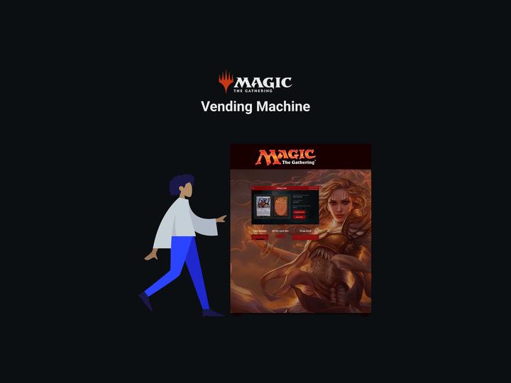
The MTG Vending machines streamlines the process of buying and selling common and uncommon cards by allowing customers to do it through the machine rather than waiting in line and getting an offer from the staff. When selling cards, the vending machine would scan the cards and compare them to a database where it would then use to offer price.
Customers would have to get their card from the staff that they could then use to build up a balance (either by selling cards or putting money on at the register) to use when buying cards from the vending machine.
Sketches

User Flow Diagram

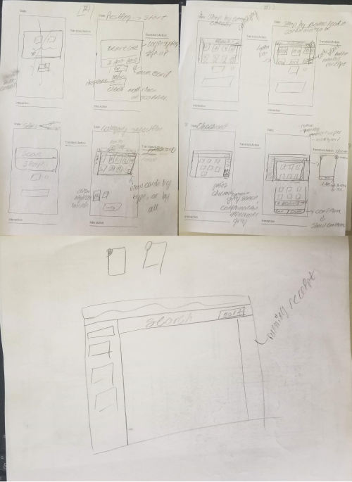
Before using the vending machine, customers would first need to get a card from the staff who would activate it. From there they can use the card with the vending machine to:
- sell common and uncommon cards
- buy cards available from the machine
Wireframes

Style Guide

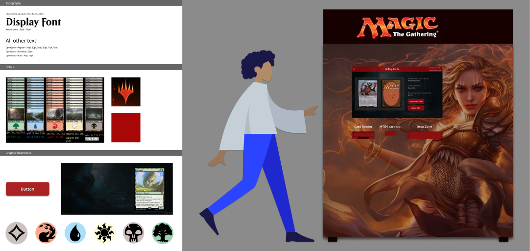
For our final design, we decided to use the official Magic The Gathering colors along with the Beleren typeface, which is used in the game’s logo, as a display font.
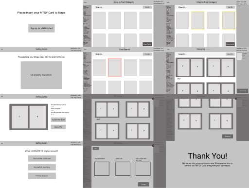
Our initial design for card category selection too inconsistent and could confuse users so we updated those with large rounded tiles depicted each card type with color and symbols. We also spruced up the filters with the MTG logo rather than checks.