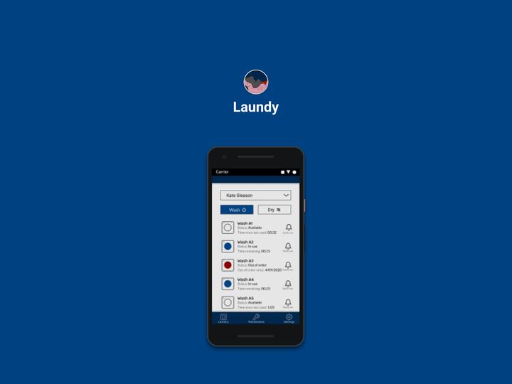
Laundy Mobile Laundry App

The Problem
Laundry rooms are the worst, you have to make sure you arrive at a not-to-busy time or risk waiting for people to finish their laundry before you even start, making your already long wait time for clean laundry, even longer. And when something goes wrong, you either have to find a worker and notify them, or fill out a form online that might not even be mobile friendly.
The Solution
Laundy allows owners of community laundry rooms such as laundromats and laundry rooms in large buildings such as dorms to give customers or tenants an smarter way of doing laundry. With Laundy, users can:
- tell when a laundry machine is in-use, available, or out of order.
- Easily report an issue with the machines or anything else in the facility right from the app.
Low-fi Prototype
Please note that prototypes might not display properly on mobile screens.
Evaluation of Lo-fi Prototype
Evaluation of my lo-fi prototype gave me some valuable feedback early on.
Users did not understand that the placeholder icon I placed next to the machines in the laundry tab were buttons.
Users wished that unused machines had a timer that reports how long it was finished or how long the door remained closed after the cycle was complete.
Users appeared to not understand what the “Not a Machine” checkbox was for.
Suggestions for Future Features
- Manual alternative for communities with older machines
- Mobile pay method as an alternative for coin machines
Suggested Revisions
- Add a timer for unused machines.
- Add a footnote that explains what “Not a machine” means
Hi-fi Prototype
Please note that prototypes might not display properly on mobile screens.
Evaluation of Hi-fi Prototype
- One user got confused between the maintenance and reporting a bug. The same user suggested that report a bug should be located in a 4th tab.
- The communities in the community dropdown were not ordered alphabetically.
Suggestions for Future Features
- Add information for machines that says what cycle it is on.
Suggested Revisions
- Make the difference between reporting a bug and making a maintenance request more clear.
- Make the communities in the community dropdown in alphabetical order.
Conclusion
This project was conducted at the hight of the COVID-19 crisis in 2020 which unfortunately severely limited my access to participants due to time, location, and other obligations brought up by the crisis. Therefore, I unfortunately had very limited data and did not have much feedback to go off of aside from my own judgement. Overall though, I am happy with the way my design turned out. In the future, it might be worth coming back to this project to get more user testing and add more features such as the one’s suggested.