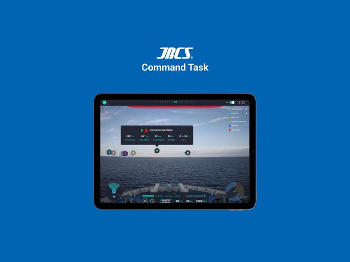
JRCS Command Task
The Problem
One of the JRCS Digital Innovation Lab’s flagship products is a command application that provides captains and officers on ships at sea with information regarding the navigation of their vessel, and highlights nearby vessels through AR as well.
The team provided me 2 screens and wanted me to design a method for the application to warn users when they are about to collide with another vessel as well.
Users and Requirements
I started by recognizing my users and establishing any requirements.
Users
- Captains
- Officers on “watch”
Requirements
- Must grab users attention
- Must Provide enough information for users to act upon
- Cannot drown out any other important information
Sketches
After establishing my users and requirements. I started sketches out my ideas.
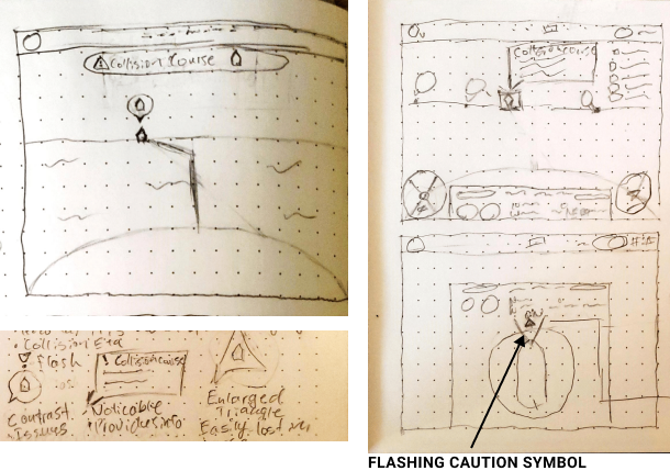
My immediate thought went to some kind of popover that pointed to the vessel the user was about to collide with.
I experimented with 3 different shapes, but ultimately settled on a simple rectangular popover window that provided users with the needed information.
I also thought about adding lines that indicate the path that each ship was going to take. However, after moving on from my sketches, I decided to scrap that idea as it could be very difficult to implement given the program would have to calculate the angle of the ship, and the surface of the water. Not only would that be a lot to calculate and take into consideration, but rough water at open sea is not exactly computer vision friendly for those kinds of calculations.
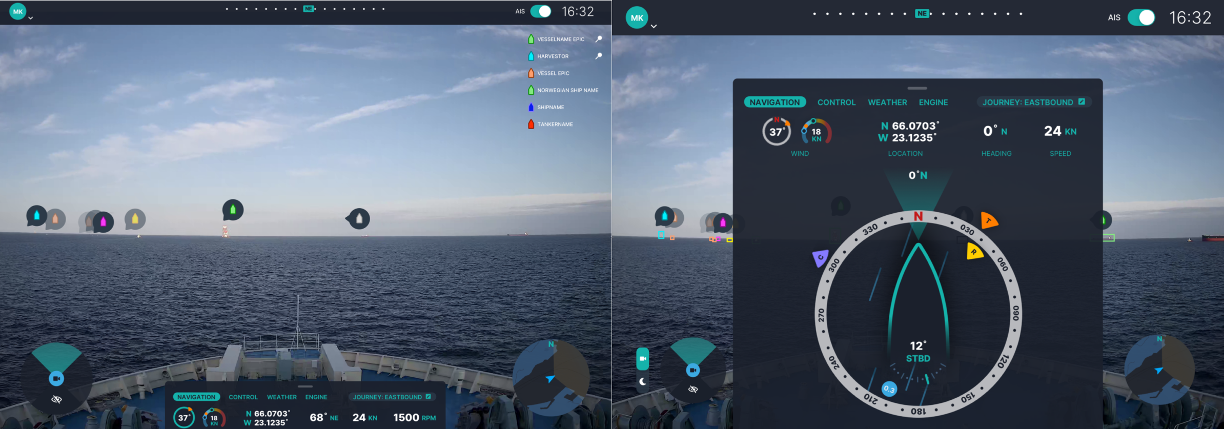
Lastly, the application has a view with a sort of compass view. I thought of a way to give users warning while in that view.
Lo-fi Wireframes
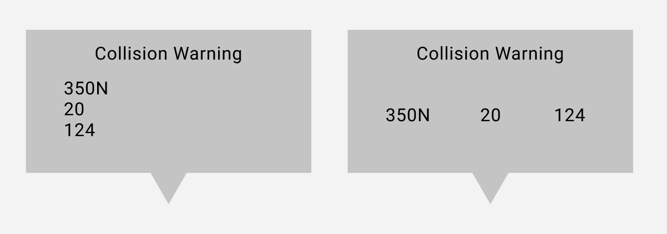
After my sketches, I decided to focus on the primary view and created a couple variations of a low-fi wireframe for the popover.
I tried the popover with the information provided vertically, and horizontally. I decided to be consistent with the established UI of the application and went with horizontal.
Hi-fi Wireframes and Progression
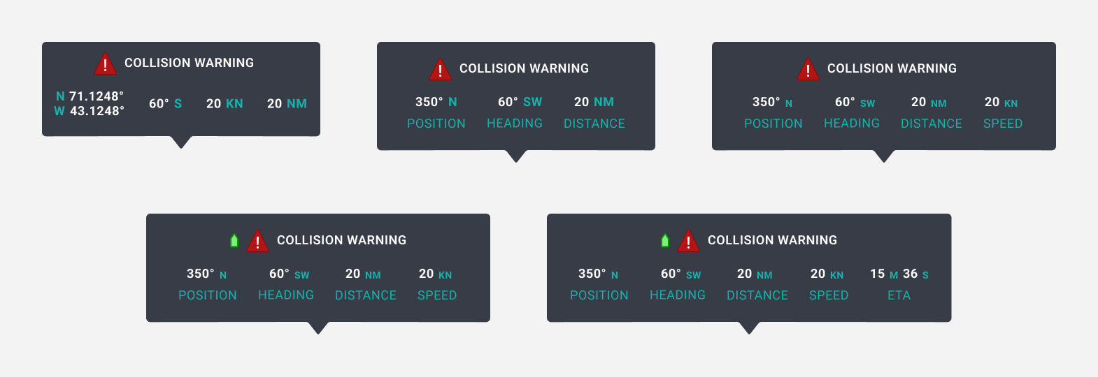
After deciding on a structure, I stylized the popover using the style of the applications UI to make it match the existing design standards of the application.
From there, I progressively start making changes such as adding labels and the boat indicator.
Popover in Context
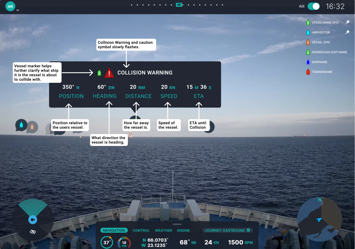
This is the popover when put into context with some notes.
Pulse
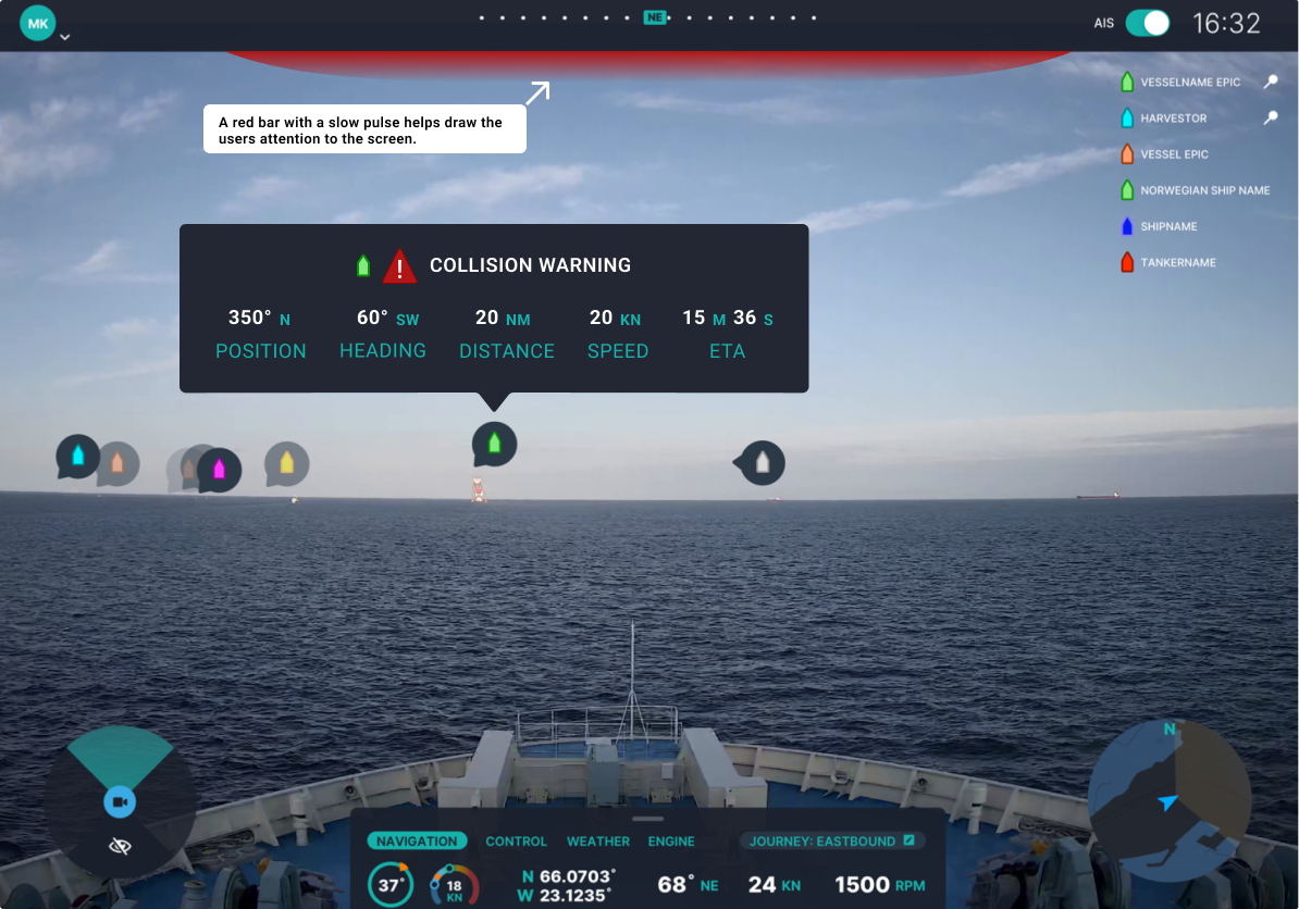
In addition to the popover, I decided I wanted something that draws the users attention to the screen in the case that they are not looking.
Inspired by FPS games such as Halo, and Call of Duty, I decided to add a pulsing red bar at the top of the screen that draws users attention to the screen without being overwhelming.
Transparency
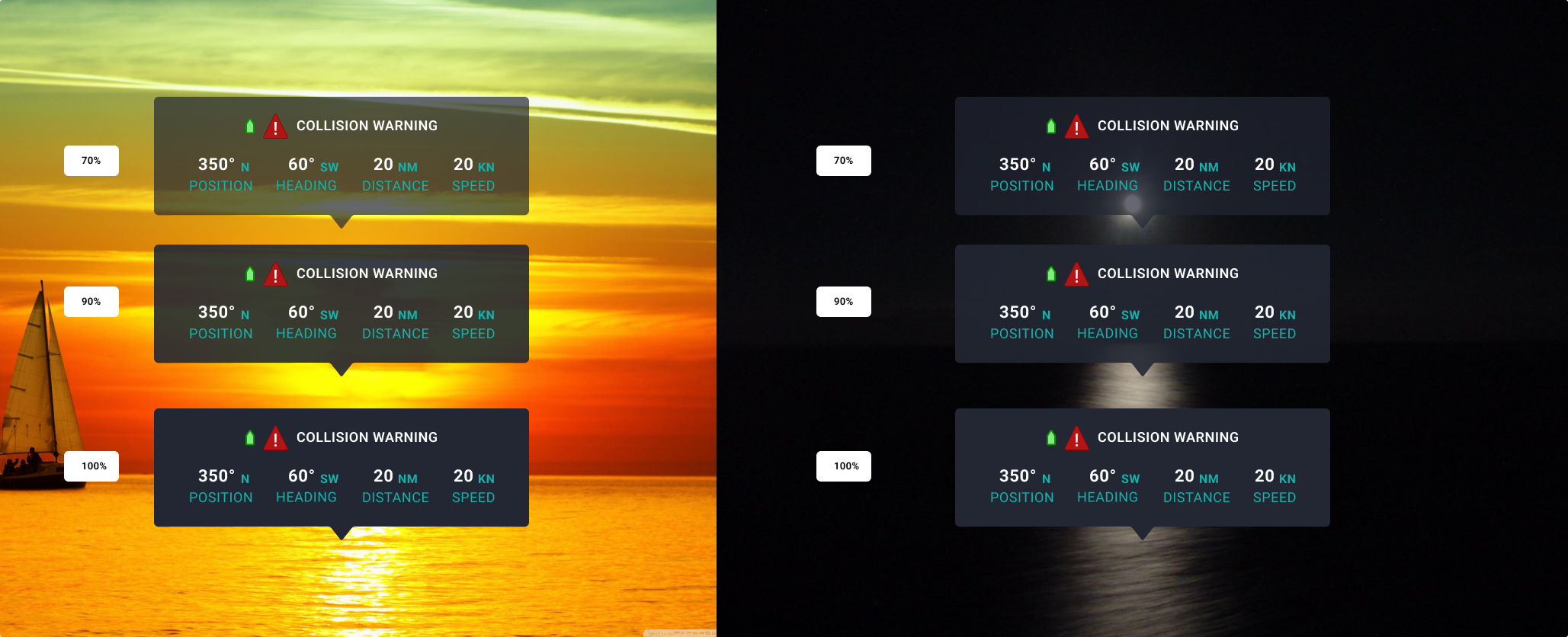
To explain why I chose to make my popovers have an opacity of 100%, here’s a slide from my presentation that shows the popover over sunset/sunrise and nigh time settings with various transparency settings.
As you might be able to tell, while transparency works at night and possibly mid-day, it makes the popover information harder to read when it comes to sunset/sunrise settings.
Color Blind Filters
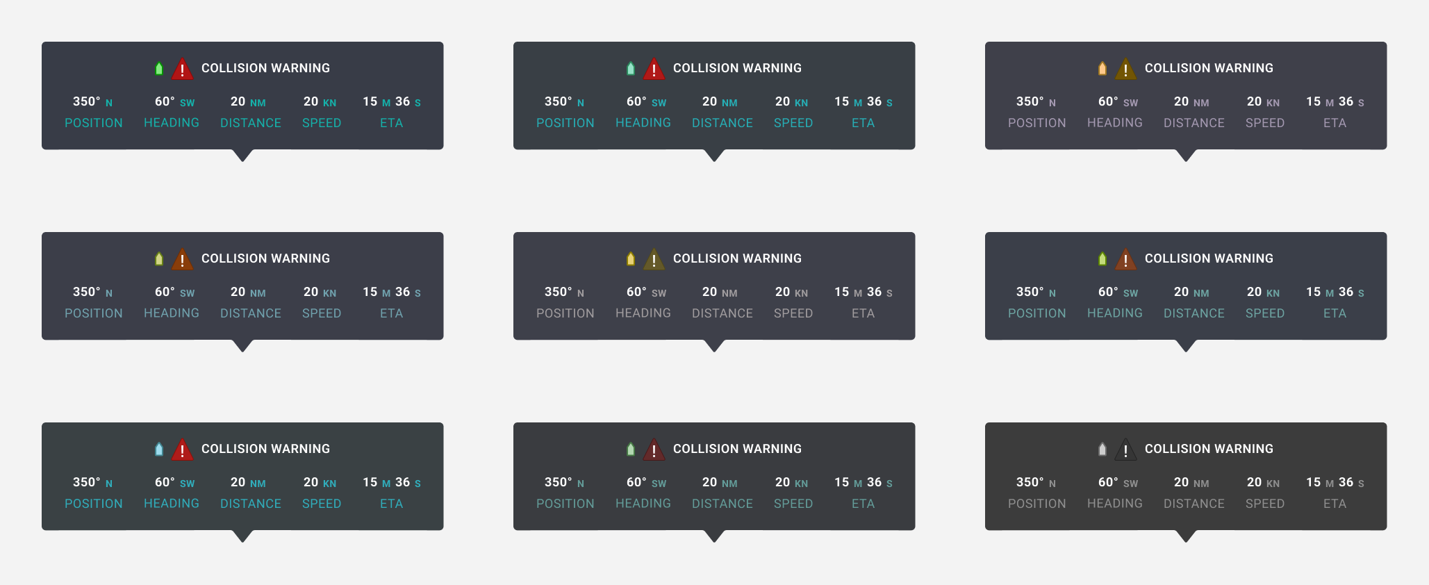
Lastly, I ran my popover through every colorblind filter to make sure it was accessible.
Conclusion
Unfortunately, while the team really liked my designs, they could only hire 1 person and ultimately I did not get the job. However it was really fun to design and I’m proud of the work I did.
Jacob Scarani
Product Designer
Seeking new Opportunities in UX Design, UI Design, Product Design, and Interaction Design.